
Although this blog is relatively recent, keen readers since Day 1 may being to understand that the link between economy and demography is features fairly high in my list of interests. Indeed, as expressed a few weeks ago, I believe the changing paradigm will force company executives and policymakers to adapt themselves to an unprecedented extent. If they fail to adapt sufficiently, I fear our societies face the risk of an ‘economic heart attack’.
To simplify, when it comes to labour activity, all individuals within a country can be classified according to 3 categories – those looking for a more rigorous classification can refer themselves to the US Bureau of Labor of Statistics, for instance:
- ‘Active’ individuals are those performing paid work, i.e. receiving monetary compensation in exchange for their contribution to the production of goods and/or services;
- ‘Unemployed’ individuals are those seeking to perform paid work, but unable to do so – this block in particular tends to be divided in a very wide array of situations, which I will not discuss here;
- ‘Inactive’ individuals are all individuals not fitting in the first 2 categories. You would find pensioners, students, schoolboys and schoolgirls, stay-at-home parents (hence the terminology ‘inactive’ can be misleading!), disabled people unable to work etc.
To give some graphic perspective, I have used the US as an example, overlaying the labor force participation rate (i.e. the share of employed and unemployed within the entire population) and the employment rate (i.e. the share of employed within the employed and unemployed population) by age and gender on top of the 2023 age pyramid. Due to data limitations, I cannot pretend that the build is perfect (e.g. I could not find the labor participation rate for 2022, only for 2021), but I think it gives us a good enough ballpark view.
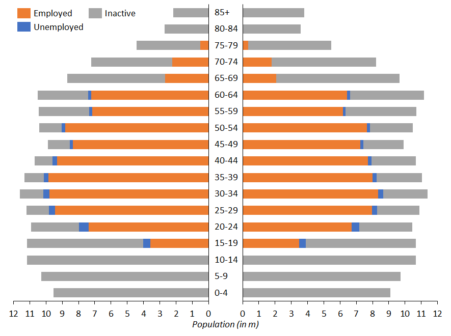
Sources: United Census Bureau, U.S. Bureau of Labor Statistics, own computations
To repeat the heart analogy expressed in the title, if we consider the United States as a completely autonomous economic zone (which is obviously far from being the case), the orange zone “irrigates” the whole economic body. If the orange zone becomes relatively too narrow, the body is not irrigated enough, i.e. not enough goods and services are produced to satisfy the demand, leading to inflation and/or the need to fill the gap with imports, leading to a trade imbalance (which is ultimately also inflationary). So keeping the heart strong and dynamic is a key objective of any economic policy.
We could add to this age pyramid a dimension of depth, comparable to the quantity of “blood” that each active individual is able to inject; in economics, we speak of productivity.
In that context, when looking at this chart, the reader may be surprised that newspapers almost exclusively focus on the evolution of the unemployment rate (the blue area) to assess the health of the economy, whereas this phenomenon only represents the edge of the heart – I do not want to undermine the social importance of the issue though, bringing unemployed people back in the workforce should be a priority for any government. Today, we tend to celebrate that unemployment is at almost all-time lows in many areas of the globe. Are these cries of joy justified? Not necessarily, unfortunately.
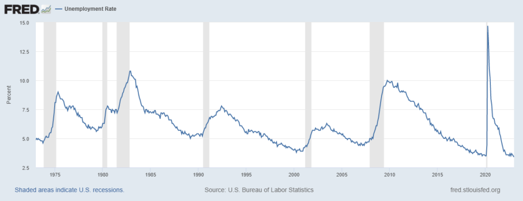
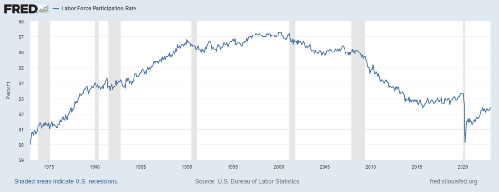
When looking at the bigger picture, we see that the labor participation rate (the share of orange + blue) peaked around the year 2000 and has been on the decline since, which can be explained by an aging population and longer studies. However, more worryingly, looking at the recent times, the labor participation rate has not recovered from its pre-COVID level (by about a percentage point). To go back to our chart, this means that, since 2020, the grey area has eaten approximately 3m individuals from the red and blue areas – not insignificant.
How do we offset the trend and ‘make the heart great again’? In theory (you will see what I mean by ‘theory’ shortly), there are a few ways to increase the share of orange:
- Trim grey and/or blue out of the population: In crude terms, it simply means killing and/or deporting inactive and unemployed individuals. Not sure this would fly ethically speaking. Furthermore, we will see that economically ‘inactive’ and ‘unemployed’ individuals may have a societal role to play. So we will leave that path.
- Reduce the unemployment rate (blue area): As mentioned earlier, this has almost been the sole focus of policymakers for half a century. Given the current unemployment levels, the leverage is limited – which, again, does not mean we should reduce the current effort spent on finding jobs for those unemployed.
- Increase the participation rate (transform grey into orange, ideally): To do so, we could ‘drag’ grey individuals from the top (1), the bottom (2) or the side (3) of the chart.
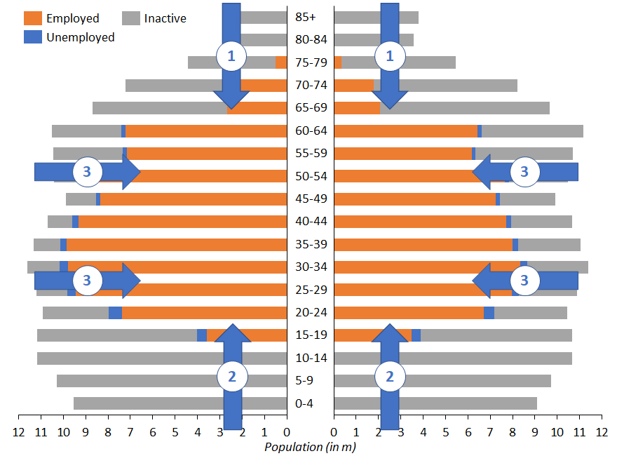
- (1) consists in a mix of increased retirement age and enhanced senior employability. It is indeed counterproductive (more costly and morally destructive) to bring older people into the workforce if we cannot find them a suitable job and they end up being unemployed.
- (2) raises the issue of the integration of young people into the workforce. Here, we could ask ourselves if the ‘diktat du BAC+5’, which I think I observe in my native country, does not harm some young people and the whole society by pushing all students to the Masters level, thus delaying, sometimes unnecessarily, the age of entry into the business world. Conversely, my host country has valued the ‘apprenticeship’ system, which provides around two thirds of young people in Switzerland with the opportunity to enter the workforce as early as 18 or 20. Official statistics indicate that 35% of the Swiss population has only continued their studies at the level of ‘initial vocational training’, putting more emphasis on on-the-ground experience. Again, each country needs to strike the right balance, since throwing underqualified young people into the engine will not create anything but unemployment and despair.
- (3) remains an enigma of the post-COVID era. When looking at the labor participation rate by age group, we notice that the ‘disengagement issue’ seems to focus on the over-55 population, who have taken advantage of COVID to withdraw from the workforce and retire early. The exact reasons remain to be quantified, economists most often quote a mix of fear of COVID in the workplace and a wealth effect triggered by buoyant stock and real estate markets.
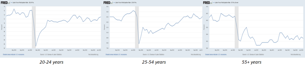
Source: St Louis FED
In this last paragraph, I would like to move beyond a dichotomy between gray and orange and highlight a possible synergy instead. Indeed, rather than wanting to bring people back to the “market” world of work at all costs, against their will or their interests, and at the risk of bringing them to the unemployment trap, it seems interesting to me to consider how the ‘economically inactive’ can be real ‘active principles’ for our society – linking back to our initial image, a healthy body has a positive impact on the heart. I am thinking here of the value that each of us can make of our time by drawing on our experience and qualities. The activity of a stay-at-home parent is an obvious example (note that in Switzerland the experience of a stay-at-home mother is officially recognized by a federal certificate), civil service, volunteering, mentoring of older people for the benefit of younger people, etc. The possibilities are numerous and worth exploring on paper. In practice, the overhaul of the implicit pact underlying each of our societies will require not only an economic argument, but also a real change of mindset.